Don’t Be Cross: Hatching vs. Harsh Shadows in Illustrations
A meditation on the different shading techniques I use, and their distinct pros and cons.
Link to Original Article: https://medium.com/@rossdcrow/dont-be-cross-hatching-vs-harsh-shadows-in-illustrations-c1acc4e126e1
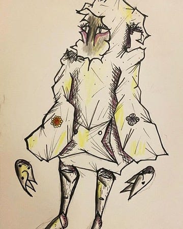
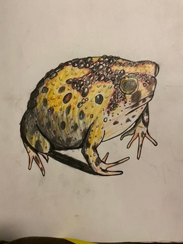
As an pen-and-ink artist on Instagram, I regularly experiment with different shading styles, trading off between three methods: hatching, cross-hatching, and harsh shading. Here are my definitions as well as accompanying drawings of each approach:
Cross-Hatching: rapid pen strokes with cross-cross lines. Generally used at the edges of subjects. Commonly observed in woodcut art from the 16th century, such as the work of Albrecht Dürer, or in Gilded Age political cartoons.
Hatching: almost the same as cross-hatching, except there are no criss-crosses, only straight or diagonal lines that run in parallel to one another.
Harsh Shading: full, deep shadows, which better resemble the light physics of actual shadows, albeit often much darker. Unlike the previous two methods, harsh shading presents a stronger contrast between the light and dark portions of a subject, mimicking the appearance of a figure in bright light. I favor this approach when illustrating a specific animal species, or when recreating the look of 90’s CGI animated characters through my two-dimensional medium, namely my various sketch books.


Pros of Cross-Hatching and Hatching
Easier for less-experienced artists.
Effectively recreates medieval, woodcut, and Victorian visual styles.
Excellent for creating the illusion of rounded edges and for a general sense of depth across cylindrical surfaces, such as human limbs or an octopus’ tentacles.
Strong choice for representing figures in low-light situations, such as by fire or candle light against otherwise full darkness.
Cons of Cross-Hatching and Hatching
Not the best at recreating harsh lighting or at representing shiny surfaces, such as metal or water.
Leans into style more than realism, and therefore is not the best choice for accuracy, especially when illustrating animals with smooth or shiny surfaces. In my experience, I botched an image of a manta ray by using hatch lines across its back, betraying the smooth, uninterrupted appearance of the actual animal’s back.
Pros of Harsh Shading
Creates bold, dramatic images.
Incorporates black or other dark shades in a way that has an immediate and striking effect on the viewer.
Works effectively for graphic novel, comic book, or manga-inspired images, as it features a generous use of black or other dark shades to help bolden characters’ features.
Cons of Harsh Shading
Not always ideal for recreating subjects in low-light situations.
Its dramatic look limits its application to certain subjects, as it might appear too harsh for characters or creatures that meant to look gentle or soft, such as babies or cute animals.
While ultimately a good technique to understand, harsh shading is not the most beginner-friendly, as it will take many artists time to develop a grasp of light physics, and an intuition for where shadows would appear relative to a light source.
